Search Posts
Recent Posts
- Kent Hospital Plans Major Renovation to Modernize Campus, Expand Care March 30, 2026
- Business Monday: Networking for Success. Before You Go – Bob Salvas March 30, 2026
- House Lawmakers Must Not View Aging as a Partisan Issue – Herb Weiss March 30, 2026
- FREE Virtual Workshop for Homebuyers: Beacon Bank for Financial Literacy Month March 30, 2026
- Rhode Island Weather for March 30, 2026 March 30, 2026
Categories
Subscribe!
Thanks for subscribing! Please check your email for further instructions.

Tradição! Portugal’s passionate about it’s symbol
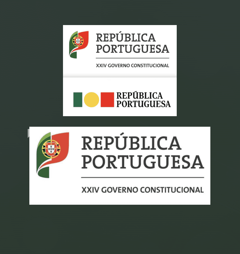
Last year a new government party took power in Portugal. One of the first things the party leadership did was to switch up the country’s logo. Going from a “coat of arms” to a more modern, stylized, logo of graphic symbols…

However! Elections have consequences, and this year another party took control – and – you guessed it – they set out to immediately change it back!

António Leitão Amaro, Minister of the Presidency, said that returning to the former logo “restored essential symbols of our identity, history and culture.”
Eduardo Aires, referred to as “Portugal’s leading graphic designer”, is the creator of the more contemporary logo, which he said had “given design unprecedented attention in Portuguese society,” and said it was “surprising that a design project had gained such importance.” One of the reasons to redesign the logo was that when shrunken down the intricacies of the symbol became unrecognizable, a fact agreed upon. Hailed upon its launch as “inclusive, plural and secular”, its main purpose was nonetheless practical rather than political. The modern designer has had death threats.
The switcheroo – two in two years – has ignited much passion, with some Portuguese celebrating the reappearance of historical symbols on social media, while others have taken to circulating a petition to accept the modernized logo.
The petition has over 7,500 signatures. The petition doesn’t deal with the heraldic “coat of arms”, as much as it appeals to the field of graphic design and “moving forward” rather than staying with the old-new logo that “drags us into the past”. The new (now old) logo was even called “woke” and “unpatriotic” – simplistic and childlike in its use of a primary color palette and a building-block selection of rectangle, circle and square”.

The new Prime Minister said he has no regrets, noting “The campaign’s commitments [which he ran upon for election] are to be fulfilled, and this was one of them.” He noted the return to the original country logo “restored essential symbols of our identity, history and culture.”
What say you?
Are you a fan of bringing back the “old” as “new” – or hanging on to the “new” as “new”? Leave your comments, below!
