Search Posts
Recent Posts
- Burn with Kearns: Training Like a Fighter Starts in Your Gut – Kevin Kearns April 4, 2026
- Rhode Island Weather for April 4, 2026 April 4, 2026
- Controversy Deepens as Second ‘Remember Iryna’ Mural Rises on Federal Hill April 4, 2026
- In the News… Quick Recap of News of the Week, Ending April 3, 2026 April 4, 2026
- TODAY in Pawtucket: First 500 Get FREE Food & Essentials at Elisha Project’s Easter Event April 4, 2026
Categories
Subscribe!
Thanks for subscribing! Please check your email for further instructions.

Going for the ugly at RIPTA – David Brussat
by David Brussat, Architecture Here and There, contributing writer
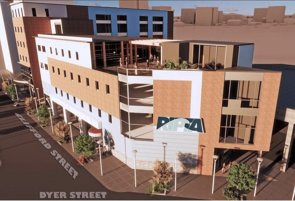
Photo, top: Proposed new transit center at Doorance and Dyer streets. (RIPTA)
The Rhode Island Public Transit Authority has finally got with the program, or so it seems. It has apparently ditched its relatively attractive new transit hub on Dorrance Street for a plug-ugly center that checks all the boxes for what passes for the latest in contemporary architecture. Cheesy materials and even cheesier factory generated design. Look at how thin the exterior walls are. Got it.
Good work, guys! This may only be a computer generated prototype put out by RIPTA to illustrate its latest request for proposal (RFP), but the mere fact that the agency has decided to replace its more or less traditional building proposal with something like the above shows that it has bought fully into the ugly club.
My skepticism of RIPTA’s reasons for relocating its bus hub out of Kennedy Plaza remains. My doubts have been moderated until now by the enticement of a relatively attractive proposal. I still do not believe that the buses need more room to expand, because, first, there is less room to expand at the proposed center on Dorrance Street than on Kennedy Plaza. KP already has a building (and quite attractive) where the public can wait for buses or buy bus tickets. And there is no compelling reason for moving out of Kennedy Plaza in the first place. Moreover, Rhode Island is not exempt from the national trend, post-covid, of working from home rather than the office. RIPTA may need to contract rather than to expand.
RIPTA’s decision to embrace a modernist design should encourage bus riders to double down on their opposition to the proposed new hub on Dorrance. It is nothing but a way to spread around the buckets of federal covid relief funds – essentially, a scam to rob the public of needed post-pandemic services in order to give more money to designers, developers, city and state officials, public art commisars and private-sector busybodies who don’t need it.
RIPTA’s announcement of the RFP last week states that it “invites qualified and experience entities from the private sector to submit proposals to design, build, finance, operate and maintain the Transit Center through a progressive joint development project delivery model.”
What in blazes is a “progressive joint development project delivery model”?
It probably means that the agency will place such dubious goals as equity and inclusion ahead of quality and utility (not to mention beauty). Whatever it is, it sounds like a waste of public funds and a further dilution of quality in public service – in short, same old same old.

Here is the original drawing of the proposed Dorrance Street hub. It is not perfect but is much better than the newly released design and, for that matter, the usual designs for buildings that have been proposed to serve the public in recent decades, in Providence and most other places.
No architect has been identified for either design, though the original design has all the earmarks of illustrations by the firm Union Studio, which is located downtown.
___
To read other articles by David Brussat: https://2×8.ea2.myftpupload.com/david-brussat-contributing-writer/

My freelance writing and editing on architecture and others addresses issues of design and culture locally and globally. I am a member of the board of the New England chapter of the Institute of Classical Architecture & Art, which bestowed an Arthur Ross Award on me in 2002. I work from Providence, R.I., where I live with my wife Victoria, my son Billy and our cat, Gato. If you would like to employ my writing and editing to improve your work, please email me at my consultancy, [email protected], or call (401) 351-0451.

RIPTA should stay in Kennedy Plaza. The waiting areas in their entirety should be covered. There should be 2 or 3 stories, with a green rooftop design, with grass, trees, and or shrubbery, along with public charging stations, storage lockers, self-serve bus kiosks, and free public wifi. The state should LEAD, not go backward.
Totally agree! The new design is horrendous. What the heck has happened to the architectural design industry?!!!