Search Posts
Recent Posts
- Burn with Kearns: Training Like a Fighter Starts in Your Gut – Kevin Kearns April 4, 2026
- Rhode Island Weather for April 4, 2026 April 4, 2026
- TODAY in Pawtucket: First 500 Get FREE Food & Essentials at Elisha Project’s Easter Event April 4, 2026
- Newport Restaurant Group Donates $81K for Food Insecurity from Gift Cards – Readies for Easter April 3, 2026
- GriefSPEAK: She’s come undone – Dr. Mari Nardolillo Dias April 3, 2026
Categories
Subscribe!
Thanks for subscribing! Please check your email for further instructions.
Providence’s Capital Center build-out, cont. – David Brussat
by David Brussat, Architecture Here and There, contributing writer
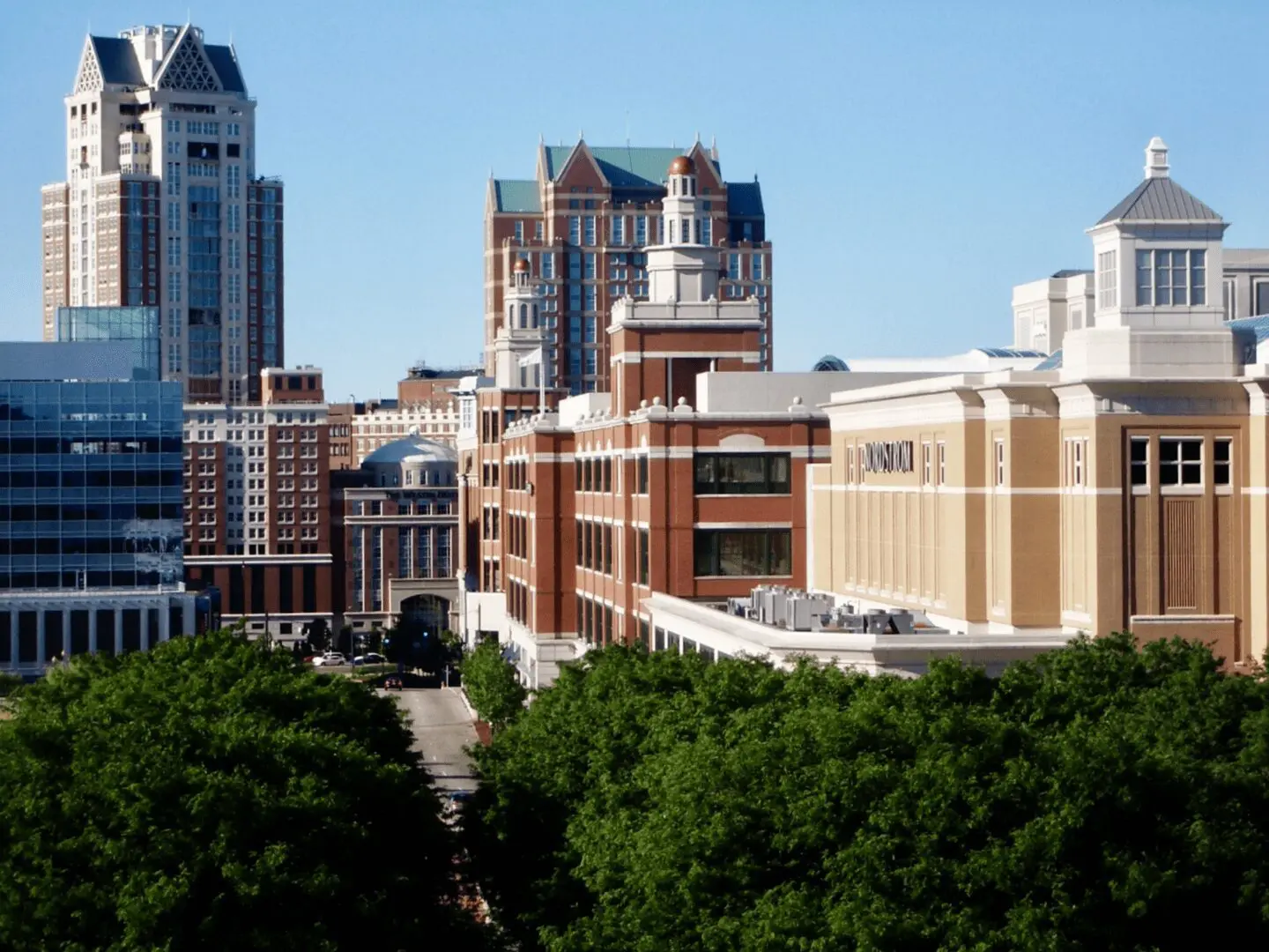
Photo: shot from balcony of governor’s office in State House. Providence Place at center and right, with Westin towers in rear. GTECH butts in from left center. (Photo by author)
To go through my photo library in search of color versions of the pictures that adorn Lost Providence is to experience a dark passage in my life, a period when all the buildings described in this chapter were arising. Occasionally they would tease me with hints of charm that I knew were destined to disappear. The brief passage of elegance represented in the photo above had passed, and was replaced by the ogres that arose between 2005-2009, described below following my (true) dream sequence.
***
In 1999, buoyed by the optimism of these developments [the recent construction of Providence Place and other traditional buildings in Capital Center] and suffused by the dubious idea that my writing had played a role in tradition’s recent successes, I contacted Quinlan Terry, the favorite architect of Prince [now King] Charles, who was crusading against modern architecture in Britain. I asked Terry whether he would be interested in doing a project in Providence and described the collection of parcels still available for development in the Capital Center district. He said “yes.” I contacted Joe Paolino, the former mayor, [U.S.] ambassador [to Malta] and state economic czar, who was by then back at his post in private real estate development. I asked him to serve as an intermediary between Terry and Robert Eder, the head of Capital Properties, the development arm of the Providence and Worcester Railroad and owner of almost all of the development parcels in Capital Center. Paolino, too, said “yes.” But nothing ever happened, and I never found out why. Having the prince’s favorite architect design a major project in Providence would have outraged establishment architects throughout America, if not the world. Maybe that is why nothing happened. Still, it would have been a great show, and great P.R. It would have put the city on the map.
Instead, the curtain rang down on this heady urbanist vision. Capital Center Commission chairwoman Leslie Gardner declared that the district needed new buildings to be “different.” Mayor David Cicilline, asked by me to call for the redesign of Capital Center’s next building, a modernist monstrosity on Parcel 9, declared that Francis Street needed stylistic “diversity.” And it was off to the races.
The first of four buildings in the third tranche of new architecture in Capital Center, the ten-story headquarters of a lottery machine manufacturer, was completed in 2006 on Parcel 9, west of Waterplace Park, blocking views of Providence Place from downriver and generally stinking up the joint. The architect for GTECH actually plopped a sketch of his building onto a poster-sized copy of Richard Benjamin’s lovely photograph. The montage looked ridiculous, even blasphemous. The architect claimed that the design’s reflective glass would enable the building to “disappear.” Its completion proved that notion fanciful, as anybody would expect. The argument that a building won’t be so bad because it will be virtually invisible hardly stands as a ringing endorsement of its architecture.
The original building proposed for Parcel 9, in 1998, where GTECH eventually arose, had been the square version of a circular firing squad. As designed by New York modernist Hugh Hardy, each of its sides vied to out-uglify the others. I visited Mayor Cianci and asked him to call for it to be redesigned. He did so on Channel 10’s Truman Taylor Show. A new, far better design was proposed and set forth by Christopher “Kip” McMahan of Robinson Green Beretta, in Providence. It was shelved after a top Providence law firm signed on as lead tenant in the proposed building, only to learn that its major client, a top national bank headquartered downtown, was threatening to end its relationship with the law firm if the latter moved its offices out of a building owned by the bank. (Providence know-it-alls may enjoy filling in the scandalous blanks.)
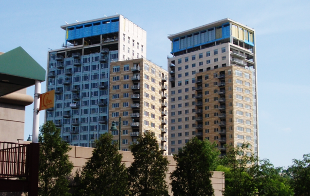
The second and third modernist buildings in this phase are the two towers, seventeen and nineteen stories, of the so-called Waterplace Luxury Condominiums on the northern edge of Waterplace Park, completed in 2008. Some observers may find it baffling that these two buildings are considered by the public to be even less appealing than the boxy coldness of GTECH. My wife, Victoria, provided the most plausible reason for that view I have heard: it’s a reversal of expectations. People have internalized the expectation that where they work will necessarily be less attractive than where they live. Some critics have said that the towers appear to be constructed of materials liberated from the warehouses of the Providence Housing Authority. Maybe so, but they do not come near to challenging GTECH as exercises in frigidity, sterility and unneighborliness.
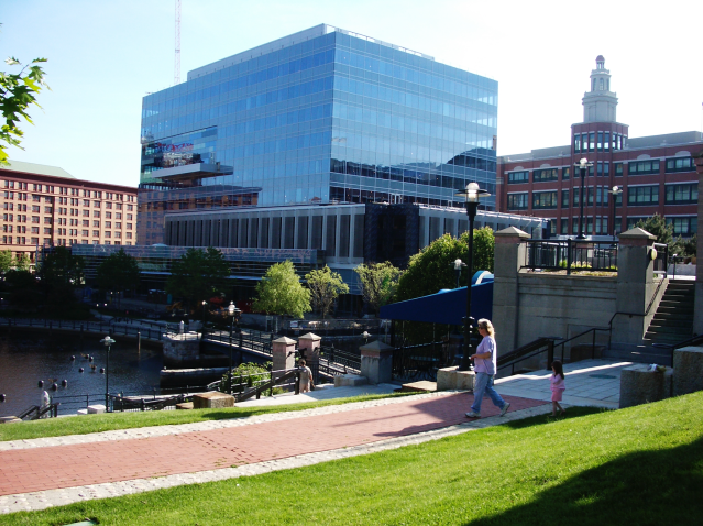
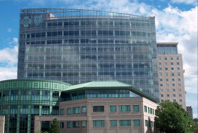
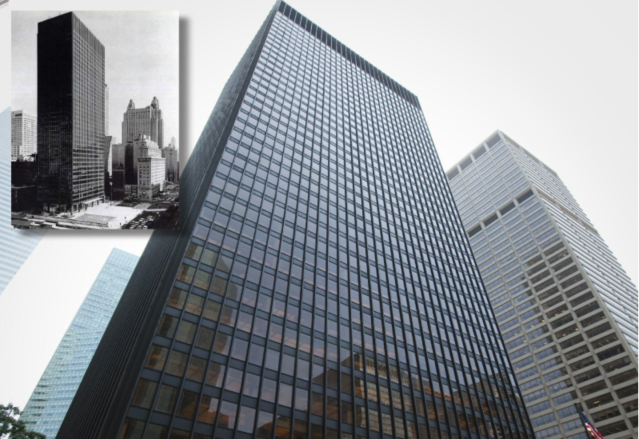
The fourth modernist building in this set is the new Blue Cross/Blue Shield of Rhode Island headquarters, designed by the firm SMMA, whose completion in 2009 just beyond the northern edge of Waterplace Park blocks views of the State House from the Waterplace condo towers. Aside from a relatively pleasing curvature of its south-facing façade, it is a typical Miesian glass box. “Miesian” is the term of art for the flood of buildings (by architects known as “Mieslings”) that arose along Manhattan’s Park Avenue and, alas, elsewhere. This glass-box frenzy erupted after the Seagram Building (1958), designed by Ludwig Mies van der Rohe, captured the already stunted imagination of America’s newly empowered architectural establishment in the late 1950s. In defense of those architects, it may be suggested that with a toolbox of rectangular glass windows set into a metallic grid, and an outright ban on ornament, there was little potential for creative differentiation in this branch of modernist style.
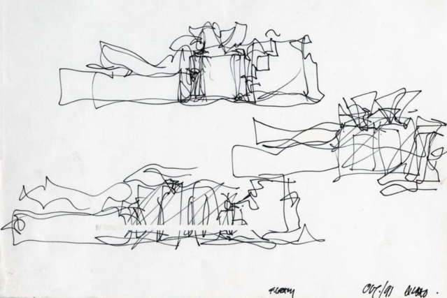
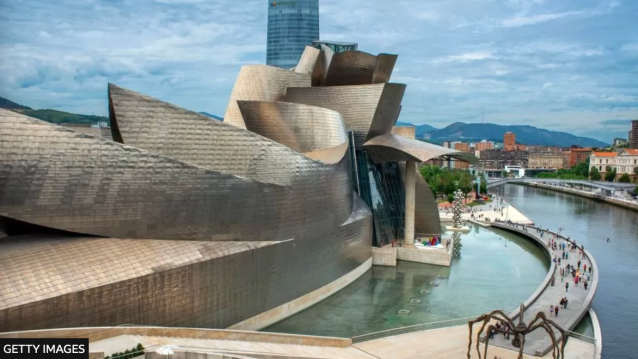
In response to the challenge posed by postmodernism, modernists shucked their rigid International Style principles and plunged into the sort of loopy-doopy somersaults, epitomized by Frank O. Gehry, the purpose of which seems to be to appear to defy the physical laws of nature. Providence has mostly managed to dodge bullets of that sort, perhaps because so little has been built since the “Great Recession” of 2008. Modernists like to insist that architecture reflect its era, so it should not surprise anyone that so much of it blows up in our face.
***
This blog has decided to take a breather before reprinting Chapter 21, “Waterplace and WaterFire,” and Chapter 22. “The Downcity Plan,” to attend to news events that merit attention but are gathering cobwebs instead.
___
To read other articles by David Brussat: https://2×8.ea2.myftpupload.com/david-brussat-contributing-writer/

My freelance writing and editing on architecture and others addresses issues of design and culture locally and globally. I am a member of the board of the New England chapter of the Institute of Classical Architecture & Art, which bestowed an Arthur Ross Award on me in 2002. I work from Providence, R.I., where I live with my wife Victoria, my son Billy and our cat, Gato. If you would like to employ my writing and editing to improve your work, please email me at my consultancy, [email protected], or call (401) 351-0451

thank God for the Blue Cross building that gave some depth to the two ugly towers’. Along with john Boehnert. i i idrafted the initial guidelines for Capitol Center. you are correct that there were sight pathways to the Statehouse and no requirement for a uniform Architectual design . the original concepts of openness and walkability got cluttered as time went on and pressures rose for development. While I enjoy your take on the subject i lived through thw first decade and there were attempts to go back to original design concepts’but the development communty was forceful in presenting proposals that did not lend to design such concepts leaving the Commission with little choice but to go along, a Hobson choice