
Subscribe!
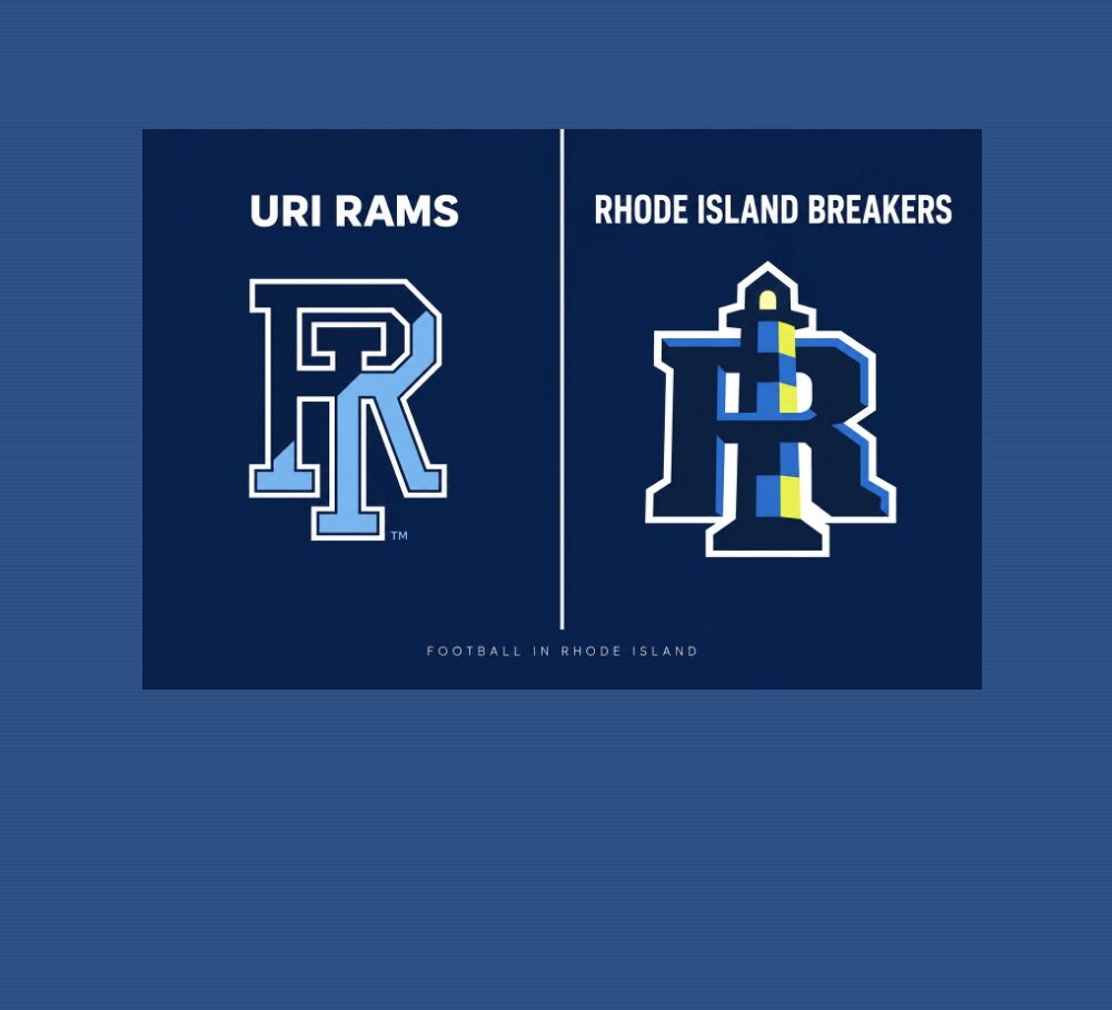
UFL unveils Rhode Island Breakers branding—but why so similar to URI’s trademarked Rhody Rams
New Rhode Island Breakers branding raises a familiar question: Does it look too much like URI?
RINewsToday has contacted URI’s licensing representatives for their comment. This is a developing story.
Rhode Island’s new professional football team unveiled its name and branding Sunday: the Rhode Island Breakers. But the new identity invites comparison with a football brand already familiar to Rhode Islanders—the University of Rhode Island Rams.
Viewed side by side, the two logos share several prominent features: interlocking “RI” initials, heavy collegiate-style lettering, white outlines, and a combination of blue and navy.
The Breakers incorporate a lighthouse into the “I” and introduce bright yellow accents. URI’s primary mark features a diagonal division between navy and Keaney blue. The lettering and proportions differ, but the overall visual resemblance raises a reasonable question: Has the new team done enough to distinguish itself? Maybe it was a nod to imitation being the sincerest form of flattery? We think not.
Was this a quick in-house design, or the work of an outside agency? Who created and approved the branding, and how much, if anything, did the UFL spend on it?
The comparison has an unusually local setting. Both teams are using Centreville Bank Stadium in Pawtucket. URI is playing its 2026 home schedule there, as it did last year, while Meade Stadium undergoes renovations; the Breakers begin play in spring 2027.
Professional football coming to Rhode Island is welcome news. Its branding still deserves scrutiny.
A new identity, familiar elements
The UFL says the Breakers’ identity draws on Rhode Island’s maritime heritage. Its lighthouse represents guidance and community pride, while its blue, yellow, navy and white palette reflects coastal waters, lighthouse illumination and whitecaps. The name also acknowledges the former USFL Breakers franchise, which once played in Boston.
Those elements give the team its own symbolism. The design question is whether they sufficiently distinguish a blue-and-navy, outlined RI monogram from the one already associated with the state university’s athletics program.
The background graphics invite comparison, too: URI’s oversized, subdued ram’s head and the wave imagery accompanying the Breakers’ branding use different symbols in a similar supporting role. Such treatments are common in sports design. Their significance here comes from the combination of elements, rather than any one feature alone.
URI’s mark has formal protections
URI’s 2022 athletics branding guide identifies the split RI monogram as its primary logo. It specifies its colors, outlines and approved variations, and includes sections addressing trademark protection and approval requirements.
Visual similarity alone does not establish trademark infringement. The legal question includes whether consumers would likely be confused about the source, sponsorship or affiliation of related products or services.
For two football programs operating in the same state and using the same stadium, however, the resemblance merits an explanation—particularly when their initials appear on hats, shirts and other merchandise without the full team name.
RINewsToday has contacted URI’s licensing representatives to ask about the resemblance and whether the university reviewed or discussed the Breakers’ identity before its unveiling.
The RI Breakers has announced some local events and activities, one of which is a visit to the Rhody Rams – maybe the topic will come up.
This is a developing story and will be updated as additional information becomes available.