Search Posts
Recent Posts
- Rhode Island Weather for April 22, 2026 April 22, 2026
- It is what it is: April 22, 2026 Commentary with Jen Brien April 22, 2026
- Southern Poverty Law Center Charged with 11 Federal Counts — Influence Reaches Rhode Island April 22, 2026
- It’s time for Sour Grapes! 4.22.26 – Tim Jones April 22, 2026
- How to Make Your Garden Grow This Spring – URI Experts Here to Help April 22, 2026
Categories
Subscribe!
Thanks for subscribing! Please check your email for further instructions.

2022 Color(s) of the year reflect Hope & Reemergence
by Nancy Thomas
Inquiring minds – especially interior and graphic designers – want to know. What will be “the color” of the year. Usually led by Pantone, there are also paint and interior design companies such as Behr, Benjamin Moore, Sherwin-Williams, and PPG, who select both decorating colors and paint colors for interior and exterior paint and trim.
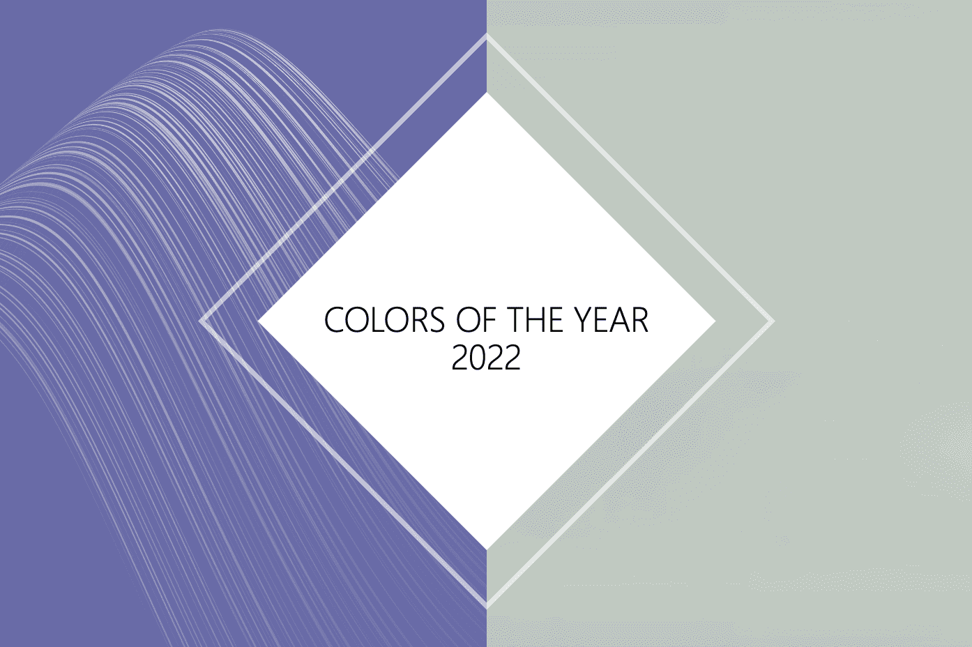
This year the paint people seem to have all had the same thought – amazing coincidence – in selecting a moss family of green color. Behr calls it “Breezeway”. The psychology reflects forward movement – a “passageway to spiritual reemergence”
Pantone went with periwinkle blue – the color that looks good on most everyone but will be seen as blue by some and purple by others.
We’ll come in with two thumbs up – one for each!

The soothing colors of green for our homes and furnishings and decorations are spot on for the times we are living in. We need our homes to be our refuge – and this color, according to the American Psychological Association encourages wellness, reduces stress, and promotes healing. The color of nature embues that feeling of wholeness and balance.

This is particularly good for office and at-home office work spaces, where multiple pulls on our attention may fray our nerves. For those with mentally challenging jobs, especially creative ones, calming tones help ease the mind into that zen zone – you can feel your blood pressure easing and take that deep breath into your next project, or phone call.
Also reflective of nature – sense a theme here? – is the Pantone choice of periwinkle blue – or, Veri Peri.

Taken from both the blue and purple family, one things about spring flowers most often, so the sense of renewal and hope revolves around this color. Particularly good for fashion, almost any skin tone – if you remember the winter, summer, fall or spring palettes – will wear periwinkle blue quite well – a color that “pops” – and with face masks and social distancing still very much leading us into 2022, the colors we wear might be our most memorable best foot forward.
“Creating a new color for the first time in the history of our Pantone Color of the Year educational color program reflects the global innovation and transformation taking place. As society continues to recognize color as a critical form of communication, and a way to express and affect ideas and emotions and engage and connect, the complexity of this new red violet infused blue hue highlights the expansive possibilities that lay before us”.
Encompassing the qualities of the blues, yet at the same time possessing a violet-red undertone, PANTONE 17-3938 Very Peri displays a spritely, joyous attitude and dynamic presence that encourages courageous creativity and imaginative expression.
There is something “rich” about both the moss green and the periwinkle – the first recorded use of the word “periwinkle” to describe the color was in England in the 1920s – so now we are thinking about tea sets and fascinators. Periwinkle is a gentle color named after the lesser periwinkle herb. Decidedly feminine, periwinkle is evocative of friendship, fond memories, and innocence. Periwinkle’s delicate qualities also makes it a popular color for weddings.
Pantone is quite upfront about the psychology of choosing periwinkle:

Speaking very traditionally, while moss green can comfortably be worn by both sexes, periwinkle is a great pop of color in the accent department of ties, shirts, socks, etc. for men. Today, though, any color goes and both make fabulous pairings with white and other colors.
Look for periwinkle to take the market in graphic design in brochures, product labels, and printed items. Moss green will be in our decorative elements. We only wish they would blend a little bit easier with each other…though while they do that in nature (think stem and flower), not so much in design and clothing. Remember, there are deep and light shades, so play with the hue and tone until you get it right if you want to use them both together – and bring in that third color for balance.
Let’s have some fun – and put them together – decidedly feminine for some…


